


CDC
Brand identity system for this developer, owner and operator of sovereign, highly secure and connected large-scale data centres across Australia and New Zealand.
Brand identity system for this developer, owner and operator of sovereign, highly secure and connected large-scale data centres across Australia and New Zealand.


The brief was to create a brand identity that feels inherently credible and world class. It should distill a sense of trust, protection and thought leadership. Because they’re about creating an ecosystem of partners it should feel inclusive but progressive. It should invoke a sense of pride amongst CDC employees.
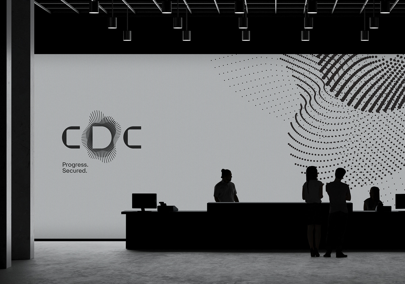
Connected for Progress is the theme for the new visual identity. With data at its core, this route shows how interconnected data can lead to progress, demonstrating that things are better together, reinforcing the potential of CDC. A design language that allows the brand to take a thought leader position and elevate above the competition. It’s a minimalist, clinical, meticulous design system for information to shine. Stripping things back to the core, it allows the brand to draw focus on the space they provide and the opportunity and potential that it brings. At the heart of the identity is the logo—data represented with a dynamic ‘Halo’ around the key letter ‘D’ for Data. The negative space of the ‘D’ acts as a window into the business.


Designed at The Royals.
Copywriter: Gary Dawson. Photography: Derek Henderson. Animation: Gareth Chang. Sketch Illustrations: Oslo Davis. Icons: The Makers Co.
Copywriter: Gary Dawson. Photography: Derek Henderson. Animation: Gareth Chang. Sketch Illustrations: Oslo Davis. Icons: The Makers Co.


